The "One-Mind OM-Cards" are so last week! When an initial Version 0.1 mint-tin deck arrived it clearly had:
- many cards with hard-to-read text (small and insufficient contrast)
- some cards with suboptimal words (too informal or inconsistent)
- box lid upside-down (hinge on the wrong side)
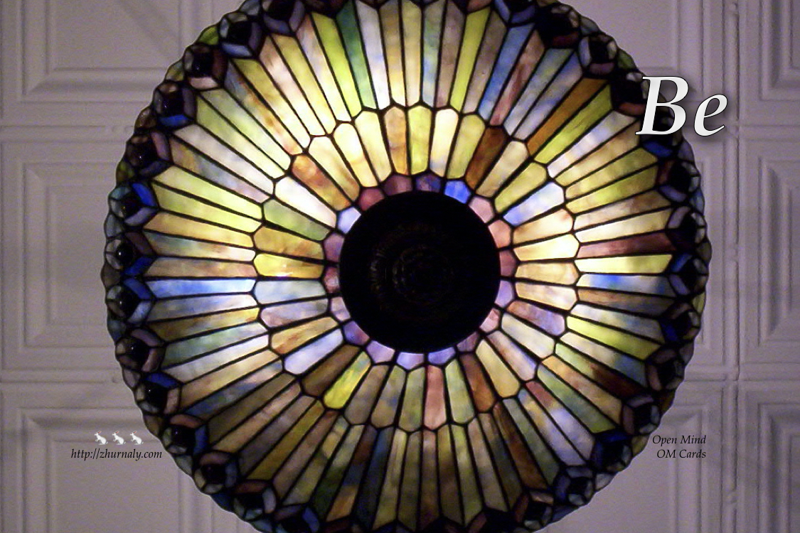
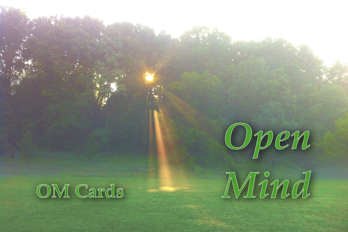
Hence, Version 0.2 is now in the works. It features a significantly larger font, hue-intensity-tweaked background images, reworded mantras, and an improved title: Open Mind, abbreviated as before OM. The new card-back design bears the reminder Be:

... the mint-tin boxtop is darker, with better-outlined font:

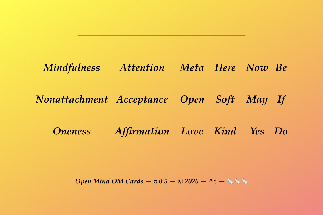
... and the box's bottom drops the distractingly mathematical last "0 - 1" column:

More changes, doubtless, to follow when the physical prototype set is delivered. Perhaps:
- arrows on the card edges or corners, front or back, to connect one card to another for "play"? ( ← ↖ ↑ ↗ → ↘ ↓ ↙ )
- explicit "suits" of Be - If - Do and clearer imagery "themes"?
- "rules" or "instructions" or "suggestions" for use?
- ... ?
To see all the OM Cards in alphabetical order go to the Om Museum.
(To get a physical deck of Om Cards see https://www.amazon.com/Generic-Open-Mind-OM-Cards/dp/B014BZ7LRY/ ...) - ^z - 2019-11-19